How to create a responsive navigation bar in next.js
Posted on 2024-09-01

Hello, today we're going to learn how to create a responsive navbar in your NEXT JS application. As navigation is a key aspect of your website that allows users to explore it, better implementation of this navbar in desktop, tablet, and mobile can help you improve the website's accessibility, which will ultimately retain your website visitors. Let me show you how I implemented it on my website, https://muhamadalzika.com, which is based on NEXT JS.
1. Project setup.
Open your project on vscode studio or create your Next.js project using bellow command in your terminal
npx create-next-app@latest
Then will, show like below.
What is your project named? my-app
Would you like to use TypeScript? No / Yes
Would you like to use ESLint? No / Yes
Would you like to use Tailwind CSS? No / Yes
Would you like your code inside a `src/` directory? No / Yes
Would you like to use App Router? (recommended) No / Yes
Would you like to use Turbopack for `next dev`? No / Yes
Would you like to customize the import alias (`@/*` by default)? No / Yes
What import alias would you like configured? @/*
In this tutorial, I'm not using TypeScript. You can select 'Yes' for all of them except TypeScript.
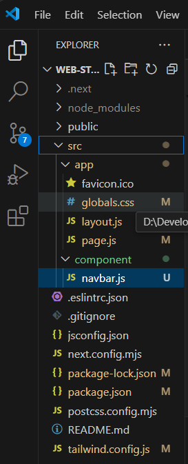
2. Setup your folder.
You can follow my folder structure setup below.

3. Write the code in the Navbar.js file.
You can follow the code bellow.
"use client"
// components/Navbar.js
import { useState } from 'react';
import Link from 'next/link';
import { FaBars, FaTimes } from 'react-icons/fa';
import { IoSearch } from "react-icons/io5";
import { AiOutlineShopping } from "react-icons/ai";
import { FaRegHeart } from "react-icons/fa";
import { RiAccountBoxLine } from "react-icons/ri";

const Navbar = () => {
const [isOpen, setIsOpen] = useState(false);

const toggleMenu = () => {
    setIsOpen(!isOpen);
};

return (
<nav className='bg-transparent p-4 shadow
 sticky top-0'>
<div className='flex items-center justify-between
space-x-2 h-16 max-w-screen'>
<div className='flex items-center '>
<Link href="/">
<h1 className='text-black text-md md:text-2xl
sm:text-md font-bold'>Logo</h1>
</Link>
</div>
<div className="relative ">
<input
type="text"
className="pl-10 pr-4 py-2 w-32 md:w-64 sm:w-48
 text-xs
md:text-md border
border-gray-300 rounded-md focus:outline-none
 focus:ring-2
focus:ring-black"
placeholder="Search..."
      />
<button className='absolute left-3
 top-2 text-gray-500'>
<IoSearch size={20}/>
</button>
</div>
<div className='md:hidden pt-2'>
<button onClick={toggleMenu}
 className='text-black
focus:outline-none'>
{isOpen ? <FaTimes size={24} /> :
 <FaBars size={24} />}
</button>
</div>
<div className='flex space-x-2'>
<div className='md:flex space-x-2 hidden
 md:block'>
<Link href="/" className='hover:animate-bounce
hover:transition-delay-300
hover:ease-in-out hover:bg-gray-100
text-black hover:text-gray-800
font-semibold text-sm py-1 px-2 rounded
shadow text-sm'>
<p>about</p>
</Link>
<Link href="/" className="hover:animate-bounce
 hover:transition-delay-300
hover:ease-in-out hover:bg-gray-100 text-black
hover:text-gray-800
font-semibold py-1 px-2
 rounded shadow text-sm ">
<p>service</p>
</Link>
<Link href="/" className="hover:animate-bounce
hover:transition-delay-300
hover:ease-in-out hover:bg-gray-100 text-black
hover:text-gray-800
font-semibold py-1 px-1 rounded
shadow text-sm">
<p>contact</p>
</Link>
<div className='relative pt-1'>
<button className="relative hover:animate-bounce
hover:transition-delay-300
hover:ease-in-out hover:bg-gray-100 text-black
hover:text-gray-800
py-1 px-1 rounded shadow text-sm">
<RiAccountBoxLine className='font-semibold'
 size={20} />
</button>
</div>
</div>
<div className='relative pt-1'>
<button className="relative hover:animate-bounce
hover:transition-delay-300
hover:ease-in-out hover:bg-gray-100 text-black
hover:text-gray-800
py-1 px-1 rounded shadow text-sm">
<FaRegHeart className='font-semibold' size={20}/>
<span className="absolute top-0 right-0 transform
translate-x-1/2
translate-y-1/2
text-xs bg-red-500 text-white rounded-full h-4 w-4
 flex
items-center
justify-center">0</span>
</button>
</div>
<div className='relative pt-1'>
<button className="relative
 hover:animate-bounce
hover:transition-delay-300
hover:ease-in-out hover:bg-gray-100
 text-black
hover:text-gray-800 py-1
px-1 rounded shadow text-sm">
<AiOutlineShopping className='font-semibold'
 size={20} />
<span className="absolute top-0 right-0 transform
translate-x-1/2
-translate-y-1/2
text-xs bg-red-500 text-white rounded-full h-4 w-4
flex items-center
justify-center">0</span>
            </button>
        </div>
        </div>

      </div>

{/* Mobile menu */}
<div className={`md:hidden ${isOpen ?
'block' : 'hidden'}`}>
<div className='flex flex-col space-y-4 mt-4'>
<Link href="/" className='animate-bounce
 hover:bg-gray-100
text-slate-300
hover:text-gray-800
font-semibold py-2 px-4 rounded shadow transition
duration-300
ease-in-out'>
            <p>about</p>
          </Link>
<Link href="/project" className="animate-bounce
 hover:bg-gray-100
                text-slate-300
                 hover:text-gray-800
font-semibold py-2 px-4 rounded shadow  transition
 duration-300
               ease-in-out">
<p>project</p>
</Link>
 <Link href="/about" className="animate-bounce
 hover:bg-gray-100
text-slate-300
hover:text-gray-800
font-semibold py-2 px-4 rounded shadow  transition
 duration-300
ease-in-out">
 <p>contact</p>
</Link>
<button className="relative animate-bounce
hover:bg-gray-100 text-slate-300
hover:text-gray-800 font-semibold
py-2 px-4 rounded shadow  transition duration-300
 ease-in-out">
<RiAccountBoxLine className='font-semibold'
 size={20} />
<span className='bottom-3 items-center'>Log-in</span>
</button>

</div>
</div>
</nav>
);
};
export default Navbar;
After that, you have to import the 'Navbar file' into Layout.
import { Inter } from "next/font/google";
import "./globals.css";
import Navbar from "@/component/navbar";

const inter = Inter({ subsets: ["latin"] });
export const metadata = {
title: "Create Responsive Navbar",
description: "Create Responsive Navbar by using Next.js",
};

export default function RootLayout({ children }) {
return (
<html lang="en">
<body className={inter.className}>
<Navbar/>
{children}
</body>
</html>
  );
}
And optionally, in the page.js file, you can write anything. If you're confused, you can follow me by writing this code in the 'page.js' file.
export default function Home() {
  return (
    <div className="flex
 justify-center items-center min-h-screen">
      <main className="container
 mx-auto p-4 text-center">
        <h1 className="text-3xl
 font-bold">Welcome to My store</h1>
        <p className="mt-4">
This is the homepage.
</p>
      </main>
    </div>
  );
}
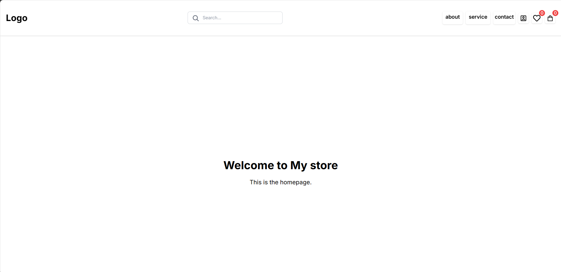
So, you have to run the code by typing npm run dev in your terminal.
It will seem like this.

Thanks for reading!
Thank you for reading! If you found this post helpful, please spread the word.
We'd love to hear from you! Let us know how we can better assist you by sharing your suggestions.
Contact us: https://muhamadalzika.com/about Email: zikafakk@gmail.com
.jpg&w=256&q=75)