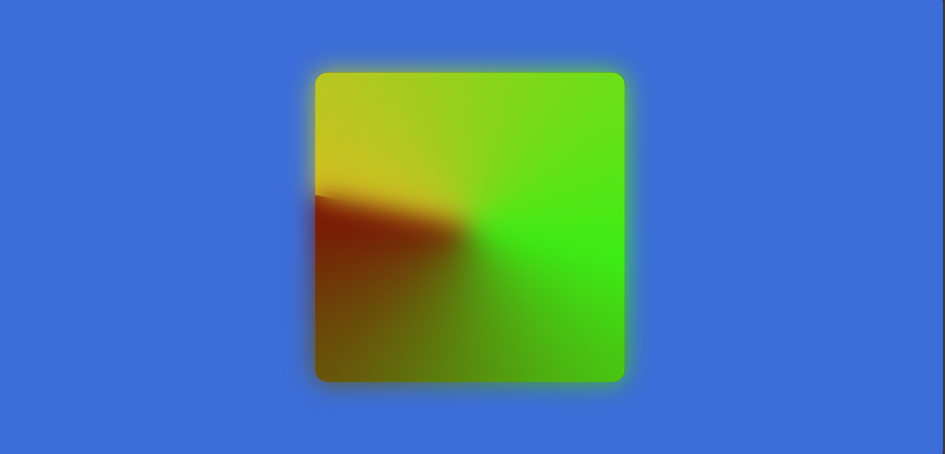
How to create simple animation using HTML & CSS.
Posted on 2024-09-06

Hello guys👋! Today we are going to learn how to create animations using HTML & CSS. What will you gain after following this tutorial? I hope you will understand and improve your styling skills using CSS and other related tools.
read also How to create a simpe calculator using HTML CSS and JavaScript
Firstly, we need to create a folder. You can name it "css-animation" or anything you prefer. Then, we will create HTML and CSS files within that folder. Name the HTML file "index.html" and the CSS file "style.css".
In the HTML file, we will set the title within the
tags. Name the title "animation-css". In the element, we will add a 'main' element with a 'div' inside it, and assign the class "box" to the 'div'. The html code. <!DOCTYPE html>
<html lang="en">
<head>
<meta charset="UTF-8">
<meta name="viewport" content="width=device-width, initial-scale=1.0">
<link rel="stylesheet" href="style.css">
<title>Animation</title>
</head>
<body>
<main>
<div class="box">
</div>
</main>
</body>
</html>
Then, we need to style and add animations using CSS. Firstly, we will set the padding and margin to 0 for the entire page. Next, we will apply styles to the
element and style the .box class.CSS code
body {
    background-color: #3c6dd8;
    height: 100vh;
    margin: 0;
    display: flex;
    justify-content: center;
    align-items: center;

}

.box {
    display: flex;
    justify-content: center;
    align-items: center;
    color: white;
    font-weight: bolder;
    font-size: x-large;
    width: 500px;
    height: 500px;
    border-radius: 20px;
    background-color: #1b1930;
    position: relative;

}


@property --angle {
    syntax: "<angle>";
    inherits: true;
    initial-value: 0deg;
}

.box::after,
.box::before {
    content: '';
    position: absolute;
    width: 100%;
    height: 100%;
    border-radius: inherit;
    --angle: 0deg;
    background-image: conic-gradient(
        from var(--angle), #d4bd23, #3ced15, #7c0d05
    );
    animation: autoRotate 2s linear infinite;
    top: 50%;
    left: 50%;
    transform: translate(-50%, -50%);

}

.box::after {
    filter: blur(20px);
}

@keyframes autoRotate {
    to {
        --angle: 360deg;
    }
}
Then, you can run your code from the terminal.
The result will look like this
Thank you for reading! If you found this post helpful, please spread the word.
We'd love to hear from you! Let us know how we can better assist you by sharing your suggestions.
Contact us: https://muhamadalzika.com/about Email: zikafakk@gmail.com
.jpg&w=256&q=75)